


Written on 15th January 2018
The last 10 years have seen a shift in the way we surf the internet. Desktop browsing (from a PC or laptop) is no longer considered the only method of browsing for information. As more people are beginning to use mobile devices, like smartphones and tablets - one thing has become clear: (and it's not even just surfing)... it's everything from browsing social media outlets, checking emails and doing some online shopping.
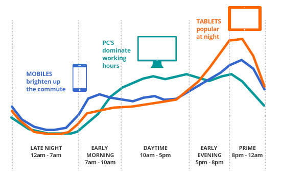
What devices do we prefer to use throughout a typical work day?
Because mobile Internet usage is increasing steadily, it's extremely important that your website is mobile friendly. You may think, ‘Why? I already have a website designed for desktop users and another site specifically developed for mobile users.’ But, is it possible to have a site that is equally favourable for both desktop and mobile users?
Answer... yes, there is - and its’ called responsive web design…
A responsive design simply means a website that has been constructed so that all of the content, images and structure of the site remains the same on any device. For example, when a user accesses a site on their desktop, they are getting the full view of the site. But when that same user goes to visit the site from their smartphone or tablet, the site will retract to fit on the smaller screen.
In other words, with a responsive website design, you don't have to have worry about having different websites for various devices or making sure that your site runs properly on a mobile device.
But there are some other really important reasons why you should make the switch to responsive design for your website.
Take a step into the outside world and you'll definitely notice a lot of people on their mobile phones. In fact, it seems that just about everyone is attached at the hip with their smartphone. For some reason, however, there are many businesses who have not yet picked up on this trend. Maybe they could use the following stats from 'Smart Insights' to convince them how much mobile usage has skyrocketed.
We all know that Google is a really big deal. In fact, Google claimed 69% of the search market share in 2018, making it the busiest search engine in the world. With that in mind, if Google claims that it prefers 'responsive web design' as the recommended mobile configuration it’s a huge hint that we should be taking notice of this statement.
But why does Google prefer responsive design? For starters, it's more efficient for Google to 'bot crawl' the site, indexing and organising all the content that is online. With responsive design, all sites have just one URL and the same HTML across all devices. When a business has both a mobile site and desktop site, there are different URL and different HTML for each. This forces Google to crawl and index multiple versions of the same exact site.
Additionally, when there is just one website and URL, it becomes much easier for users to share, engage and interact with the content on that site as compared to a site that has different pages for mobile and desktop users. Google is a fan of that as well. Why? Because what if someone shared a mobile site on a social media outlet and one of their connections viewed that mobile site on their desktop? That viewer would then be viewing a less than optimal site because it was intended for mobile. This makes the user unhappy.
And Google realizes that unhappy people will go elsewhere, meaning that bounce rates increase and the site will not rank on mobile searches. This creates a whole big headache involving Google's external link algorithm and on-page errors. Which in turn, also harms your SEO. In other words, it's just bad for business for both Google and all of the websites that aren't taking advantage of the benefits of responsive design.
Besides all of the search benefits, as well as making users happy, responsive design has the potential to increase conversion rates from all of the mobile users in the world. Why? Well, if a website is not working on mobile or tablet device, users will obviously be unable to convert. And how many people are doing online shopping from a mobile device? There has been research that found 69% of tablet users shopped on their device within the last 30 days.
So, when a user has to do more work than needed to complete a conversion, do you think that they will still convert? It's less likely they will convert. However, there's a little more to it than that. For example, since a responsive website design can adjust to any screen, developers have control on how all of those conversion elements will display on mobile and tablet.
Finally, responsive design allows you to do some important high-end heatmapping and A/B testing, which can be done through software like Clicktale or Optimizely. This means that you can segment users by mobile and gain a better picture of how those users are interacting on your site. When you do this, you can discover what sales tactics and marketing strategies are effective, as well as, those that are not. When you have this information, you can increase conversion rates.
Responsive design gives users a better experience. For example, users don't need to fiddle around with zooming and shrinking the text or images on screen – or scrolling left and right to view a certain area of the page. Instead, all of the content automatically adjusts to the screen of the device. This makes it easier and more convenient for users to read and navigate on your site.
And, there are stats to further illustrate why the experience of users is so important. According to Google's Think Insights on Mobile, whenever someone arrives on your mobile website and is frustrated, or doesn't see the content that they are searching for immediately, there's a 61 percent chance they will leave and head to another website. However, whenever a user has had a positive experience with your mobile website, that individual will be 67 percent more likely to buy a product or use a service. Furthermore, 48 percent of users stated to Google that when a site doesn't function on their mobile device it makes them feel that the company does not care for their business.
Going back to SEO for moment, if you have separate desktop and mobile sites, are you going to run separate SEO campaigns for each? Wouldn't it just be easier to manage only one SEO campaign and one website? That would make not just your customers happy, but also your team including everyone from developers to content marketing managers. More importantly because you only have one site, responsive design is more cost effective as well
Stay ahead of the competition is vital to any growing business. So, if more and more users are using their mobile devices to search and make purchases online, you have to cater to that audience by having a mobile-friendly site. In fact, 85 percent of adults believe that a mobile site must be as good, if not better than, a desktop site.
If that doesn't convince you enough, take a look at the digitalzilla.co.uk website. About a year ago, we rebuilt our site to be responsive. The aim was not only to re-brand the company - but drive more traffic to the site, leading to enquiries, which would in turn lead to more sales. In the last 6 months the amount of visitors to our site have doubled and we are starting to see the benefits of day to day enquiries. And it’s not just us… we’ve worked with several of our clients that have had similar results on the back of a responsive web build.
Stay ahead of your competition and have a site that stands out. It'll make the difference.
What next? if you like what we do, get in touch to find out how our design agency can help you
Need our help?